KPIs
What this covers
How to create, manage, and certify KPIs inside Model Builder. Tessallite provides two creation paths:
- Business Builder — a guided form where you pick measures, time windows, and filters from dropdowns. No expression language required. Best for business users.
- Advanced KPI Wizard — a 5-step wizard with full control over expressions, thresholds, governance, and formula editor. Best for modellers and power users.
For a full conceptual overview including the expression language reference, scorecard, alerts, and integrations, see KPIs (concept).
Before you start
- You must have a model open in Model Builder with at least one measure defined.
- If you plan to use time intelligence functions (
prior_period,moving_avg, etc.), assign a time dimension to the KPI. - If you plan to use KPI hierarchies (composite KPIs), create child KPIs before assigning a parent.
Creating a KPI (Business Builder)
The Business Builder is the default creation path. Click Add KPI in the KPIs panel to open it.
Name
Enter a descriptive name for your KPI. This is the label that appears in dashboards, scorecards, and BI tool queries. Choose a name that a business user would recognise, such as “Monthly Revenue Growth” or “Customer Retention Rate”.
Formula type
The formula picker organises the eleven formula types into three categories. Toggle between the categories using the segmented bar at the top, then click a formula card to select it. Each card shows a short description and an icon — click the one that matches what you want to measure.
After selecting a formula card, the builder shows the relevant controls for that type. The sections below walk through each type with a realistic business scenario, step-by-step instructions, and guidance on when to use it.
Single measure
What it does: Aggregates one measure from your model using a function you choose (sum, average, min, max, count, or count distinct).
When to use it: You want to track one number over time — total revenue, average order value, maximum delivery days, or the count of invoices in a period. This is the most common formula type and the right starting point for most KPIs.
Scenario: Your operations team wants to track the average number of days between order placement and delivery, measured monthly.
How to build it:
- Open the KPI Business Builder (click Add KPI in the KPIs panel).
- Give it a name: “Average Delivery Days”.
- In the formula picker, select the Measure category, then click the Single measure card.
- From the Measure dropdown, select “days_to_deliver” (or whatever your delivery-time measure is called).
- From the Aggregation dropdown, select Average. The other options are Sum (total), Min (fastest), Max (slowest), Count (how many rows), and Count Distinct (how many unique values).
- In the Time window section, pick “Invoice Date” as the time dimension and “Last complete month” as the preset. This ensures you always see a full month of data, not a partial one.
- Click Preview to see the current value.
- Set direction to Lower is better (fewer delivery days = better).
- Set a static target (e.g. 5 days) and configure threshold bands.
- Click Save.
Tip: If you pick “Count Distinct” as the aggregation, the system counts unique values of the measure column. For counting unique values of a dimension (like unique customers), use the Count distinct formula type instead.
Count records
What it does: Counts the total number of rows (records) that match your time window and filters. No measure selection needed — it counts rows, not values.
When to use it: You want to know “how many” without caring about a specific numeric column. Examples: total orders this month, number of support tickets, number of transactions, number of deliveries.
Scenario: The finance team wants a KPI showing the total number of invoices issued last month.
How to build it:
- Open the KPI Business Builder.
- Name: “Monthly Invoice Count”.
- Select the Measure category, then click the Count records card. No further formula controls appear — the system counts all rows.
- In Time window, select “Invoice Date” and preset “Last complete month”.
- Optionally add a Filter to exclude cancelled invoices: click Add filter, select “Invoice Status”, operator “not equals”, value “Cancelled”.
- Click Preview to see the count.
- Direction: Higher is better (more invoices = more business).
- Save.
Tip: Count records counts ALL rows. If you have one row per invoice line item (not per invoice), the count will be line items, not invoices. In that case, use Count distinct on the invoice ID dimension instead.
Count distinct
What it does: Counts the number of unique (distinct) values of a chosen dimension. Unlike count records which counts rows, this counts unique identifiers.
When to use it: You want to know “how many different things” — distinct customers who ordered, distinct products sold, distinct regions with activity.
Scenario: The sales team wants to track how many unique customers placed at least one order last quarter.
How to build it:
- Open the KPI Business Builder.
- Name: “Active Customers (Quarterly)”.
- Select the Measure category, click the Count distinct card.
- From the Dimension dropdown, select “Customer ID” (or “Customer Name” — whichever represents one customer per value).
- In Time window, select “Order Date” and preset “Last complete quarter”.
- Click Preview.
- Direction: Higher is better.
- Save.
Tip: Choose the dimension carefully. Counting distinct “Customer Name” works if names are unique. If two customers share a name, count distinct “Customer ID” instead.
Ratio
What it does: Divides one measure (numerator) by another measure (denominator). The system uses safe division internally, so you never get a divide-by-zero error — it returns null instead.
When to use it: You want a rate, efficiency metric, or unit economics figure. Examples: revenue per employee, cost per unit, selling price divided by cost, defect rate (defects / total items).
Scenario: The procurement team wants to track the markup ratio: selling price divided by cost.
How to build it:
- Open the KPI Business Builder.
- Name: “Selling Price to Cost Ratio”.
- Select the Compare category, click the Ratio card.
- In the Numerator dropdown, select “Selling Price”.
- In the Denominator dropdown, select “Cost Total”.
- In Time window, select “Last complete month”.
- Click Preview. You should see a number like 1.45 (meaning selling price is 1.45x the cost).
- Direction: Higher is better.
- Set format to decimal (2 places) or use a unit label like “x”.
- Save.
Important: The time window and filters apply to both numerator and denominator equally. If you filter to “Country = Germany”, both measures are calculated for Germany only.
Tip: For percentage ratios (like conversion rate), multiply by 100 in your mind or set the format token to percentage. The raw ratio 0.12 means 12%.
Compare periods
What it does: Compares the current period value to a prior period. Produces a variance (difference), percentage change, or both.
When to use it: You want to answer “how is this period compared to the previous one?” — month-over-month revenue change, quarter-over-quarter growth, year-over-year comparison.
Scenario: The executive team wants a KPI showing this month’s revenue compared to last month.
How to build it:
- Open the KPI Business Builder.
- Name: “Revenue MoM Change”.
- Select the Compare category, click the Compare periods card.
- Select the Measure: “Revenue”.
- Select the Comparison type: “Prior period” (or “Same period last year” for YoY).
- Select the Period grain: “Month”.
- In Time window, select “This month” (the system automatically calculates last month for comparison).
- Click Preview. You see the current value, the comparison value, and the variance.
- Direction: Higher is better.
- Save.
Tip: “Last complete month” is safer than “This month” if you want full-period comparisons without partial data.
Compare measures
What it does: Compares two different measures to produce a variance (absolute or percentage). Unlike ratio which divides, this subtracts or calculates percentage variance.
When to use it: You want to track the gap between two related numbers — actual vs budget, revenue vs cost, forecast vs actual.
Scenario: Finance wants to track the absolute variance between actual revenue and budgeted revenue.
How to build it:
- Open the KPI Business Builder.
- Name: “Revenue vs Budget Variance”.
- Select the Compare category, click the Compare measures card.
- Select the Primary measure: “Actual Revenue”.
- Select the Comparison measure: “Budget Revenue”.
- Select the Variance type: “Absolute” (or “Percentage” for a % gap).
- In Time window, select “Last complete month”.
- Click Preview. Positive means actual exceeded budget.
- Direction: Higher is better (over-budget is good for revenue).
- Save.
Target comparison
What it does: Compares a measure’s current value against its target. Shows attainment percentage, absolute variance from target, or percentage variance from target.
When to use it: You have a specific goal number (set as the KPI target) and want the KPI to show how close you are.
Scenario: Sales has a quarterly target of 500,000 and wants to see attainment percentage.
How to build it:
- Open the KPI Business Builder.
- Name: “Quarterly Revenue Attainment”.
- Select the Compare category, click the Target comparison card.
- Select the Measure: “Revenue”.
- Select the Comparison mode: “Attainment %” (value / target * 100).
- In Time window, select “This quarter”.
- Set Target type to “Static value” and enter 500000.
- Click Preview. You see something like 78% (meaning 78% of target reached so far).
- Direction: Higher is better.
- Save.
Tip: You can also set the target from a measure (e.g. a “Planned Revenue” column in your data) instead of typing a static number.
Moving average
What it does: Calculates the rolling average of a measure over a specified number of periods. Smooths out short-term fluctuations to reveal trends.
When to use it: You want a smoothed trend line rather than jumpy period-to-period values. Common in manufacturing (defect rate smoothing), finance (rolling returns), and operations (moving average of processing time).
Scenario: Quality control wants a 3-month moving average of the defect rate percentage to detect gradual quality drift.
How to build it:
- Open the KPI Business Builder.
- Name: “Defect Rate (3-Month Moving Avg)”.
- Select the Analyze category, click the Moving average card.
- Select the Measure: “Defect Rate Pct”.
- Set the Window size to 3.
- Set the Grain to “Month” (each period in the average is one month).
- In Time window, select “Last 12 months” (so there is enough history to calculate the 3-month window).
- Click Preview.
- Direction: Lower is better (fewer defects = better).
- Save.
Pitfall: Averaging a percentage. If the measure is already a percentage (like defect rate), the moving average simply averages those percentages. This is mathematically correct only if each period has roughly the same volume. If January had 100 items and February had 10,000 items, a simple average of their defect rates gives January’s rate equal weight to February’s — which may not be what you want. In that case, consider creating a ratio KPI (total defects / total items) with a trailing-sum time calculation on both numerator and denominator.
Exception / SLA
What it does: Measures how well a threshold or service-level agreement is being met. Three sub-types: compliance percentage (% of records meeting the rule), breach count (how many records violate it), or backlog (count of currently open items past the threshold).
When to use it: You have a business rule with a numeric boundary — “deliveries must arrive within 5 days”, “response time must be under 2 hours”, “invoices must be paid within 30 days” — and want to measure how often that rule is met or broken.
Scenario: Logistics has an SLA that 95% of orders must be delivered within 5 days.
How to build it:
- Open the KPI Business Builder.
- Name: “Delivery SLA Compliance”.
- Select the Analyze category, click the Exception / SLA card.
- Select the SLA type: “Compliance %” (alternatively “Breach count” or “Backlog”).
- Select the Measure to evaluate: “Days to Deliver”.
- Set the Comparator: “less than or equal”.
- Set the Threshold value: 5.
- In Time window, select “Last complete month”.
- Click Preview. You see a percentage like 92.3% (meaning 92.3% of deliveries met the 5-day rule).
- Direction: Higher is better (for compliance %; for breach count use Lower is better).
- Set a static target of 95 (the SLA target) and configure threshold bands.
- Save.
Tip: Use “Breach count” when you want to know the absolute number of violations (e.g. 47 late deliveries). Use “Backlog” when you are tracking currently-open items that have already exceeded the threshold (e.g. 12 invoices overdue past 30 days right now).
Share and rank
What it does: Calculates a measure’s share of the total, or ranks dimension members by a measure. Sub-types: share of total (percentage), rank (ordinal position), or top N contribution (what fraction the top N members contribute).
When to use it: You want to understand relative contribution or position — market share by region, rank of a product by revenue, or what percentage of sales come from the top 5 customers.
Scenario: Marketing wants to know what percentage of total revenue comes from the “Enterprise” customer segment.
How to build it:
- Open the KPI Business Builder.
- Name: “Enterprise Revenue Share”.
- Select the Analyze category, click the Share and rank card.
- Select the Share type: “Share of total” (or “Rank” or “Top N contribution”).
- Select the Measure: “Revenue”.
- Select the Dimension to partition by: “Customer Segment”.
- In Filters, add: Customer Segment equals “Enterprise”.
- In Time window, select “Last complete quarter”.
- Click Preview. You see something like 42% (Enterprise contributes 42% of total revenue).
- Direction: Higher is better.
- Save.
Tip: “Top N contribution” answers “how concentrated is our revenue?” If the top 3 customers contribute 80% of revenue, that is a concentration risk worth monitoring.
Composite score
What it does: Combines multiple measures into a single weighted score. Each input measure gets a weight (summing to 1.0 or 100%), and the result is the weighted combination.
When to use it: You want a single health index that blends several dimensions — customer satisfaction score (combining NPS + retention + response time), supplier quality index, or operational health combining several metrics.
Scenario: Operations wants a single “Supplier Health Score” combining on-time delivery (weight 40%), defect rate (weight 30%), and cost competitiveness (weight 30%).
How to build it:
- Open the KPI Business Builder.
- Name: “Supplier Health Score”.
- Select the Analyze category, click the Composite score card.
- Add components:
- Measure: “On Time Delivery Pct”, Weight: 0.4
- Measure: “Quality Score”, Weight: 0.3
- Measure: “Cost Competitiveness Score”, Weight: 0.3
- The system calculates: (On Time * 0.4) + (Quality * 0.3) + (Cost * 0.3).
- In Time window, select “Last complete month”.
- Click Preview.
- Direction: Higher is better.
- Save.
Important: Composite scores work best when all input measures are on comparable scales (e.g. all are 0-100 percentages). If one measure is in dollars and another is a count, the weighted sum is meaningless. Normalise the inputs first (create each as a separate KPI on a 0-100 scale) and then combine.
Nesting composites: A composite KPI can itself be a child of another composite — its weighted score feeds the parent, normalised against its own target like any other child. Nesting is limited to 5 composite levels and circular references are rejected; both cases produce a clear error instead of a wrong number. See KPI concepts for the full scoring rules, including how weights renormalise and why viewers with different privileges can see different composite scores.
Broken inputs are flagged: If one of a composite's child KPIs fails to evaluate (a broken formula, a query error), the composite still scores from its working children but shows a Degraded badge on its scorecard card naming the broken child. A child that simply has no data is dropped quietly. See KPI concepts for the difference between a broken input and no data.
Time calculation (optional)
Most formula types offer a “+ Add time calculation” link below the formula controls. Clicking it adds a secondary time-variant calculation that transforms the base formula’s result over time. This is different from the time window — the time window says “look at data from last month”, while the time calculation says “compare this month to last month” or “average across the last 3 months”.
When to use it: You already have a base formula (like Sum of Revenue) and you want the KPI to automatically do something comparative or rolling with it. Without a time calculation, the KPI just shows the raw value for the chosen time window. With a time calculation, it can show change, trend, or smoothed values.
How the two layers work together:
- Base formula: Sum of Revenue
- Time window: Last 12 months
- Time calculation: YoY growth %
Result: The system calculates this month’s revenue and compares it to the same month one year ago, showing the percentage change. The “Last 12 months” time window ensures there is enough historical data for the year-ago comparison to work.
Available calculations and when to use each:
Current — No transformation. The KPI shows the raw value from the base formula for the chosen time window. Use this (or leave the time calculation empty) when you just want a straight number.
Prior period — Shows the value from the previous period (previous month, previous quarter, etc., depending on the grain you select). Use this when you want the KPI to answer “what was the number last period?” — useful as a reference point alongside a current-value KPI, or for building dashboards that show “current vs previous” side by side.
Period to date — Running total from the start of the current period. For example, “Quarter to date revenue” sums all revenue from the start of this quarter through today. Use this when you want to track cumulative progress toward a periodic goal. The grain control determines what “period” means: select “Quarter” for QTD, “Year” for YTD, “Month” for MTD.
Trailing sum — Rolling sum over the last N periods. For example, “trailing 12-month revenue” sums the last 12 complete months. Use this when you want a rolling total that smooths out seasonal patterns. Set the number of periods (e.g. 12) and the grain (e.g. Month). The result is always a sum, not an average.
Moving average — Rolling average over the last N periods. For example, “3-month moving average of defect rate” averages the last 3 months. Use this to smooth noisy metrics and reveal underlying trends. Set the number of periods and grain. This is mathematically equivalent to trailing sum divided by N.
Lag — Value from exactly N periods ago. “Lag 1 month” shows last month’s value. “Lag 3 quarters” shows the value from 3 quarters back. Use this when you need a historical reference point at a fixed offset — for example, showing “what was our headcount 6 months ago” alongside the current headcount.
Lead — Value from N periods in the future. Only meaningful if your data includes forecasts or future-dated records. Rarely used in actuals-based KPIs.
Percentage change — The percentage difference between the current period and the prior period: (current - prior) / prior * 100. Use this for month-over-month or quarter-over-quarter growth rates without needing to build a ratio formula. A positive number means growth; a negative number means decline.
YoY value — The value from exactly one year ago (same period, prior year). Use this when seasonality makes month-over-month comparisons misleading — comparing December to December is more meaningful than comparing December to November in retail, for example.
YoY growth % — The year-over-year percentage change: (this year - last year) / last year * 100. This is the most common growth KPI in business reporting. Use it whenever you need to show annual growth while accounting for seasonality.
CAGR — Compound Annual Growth Rate. Calculates the smoothed annual growth rate over multiple years, assuming constant compounding. Use this for long-horizon metrics where you want to communicate “we grew at X% per year on average over the last 5 years”. Requires multiple years of data.
Practical guidance:
- If you just want “this month’s number”, leave time calculation empty or set it to Current.
- If you want “how much did it change from last month”, use Percentage change.
- If you want “how does this month compare to the same month last year”, use YoY growth %.
- If you want a smoothed trend line, use Moving average.
- If you want a running total, use Trailing sum or Period to date.
- If your metric is noisy (varies wildly month to month), moving average is your friend.
- If your business is seasonal (retail, travel, agriculture), YoY comparisons are more honest than month-over-month.
Time window
The time window defines which data is included in the KPI calculation. It answers the question: “calculate this number using data from when to when?”
Every KPI should have a time window unless it is measuring an all-time cumulative value. Without a time window, the KPI evaluates against ALL data in the model — which is rarely what you want for an operational metric.
Choosing a time dimension: If your model has multiple date columns (Order Date, Invoice Date, Ship Date, Payment Date), you must pick one. Choose the date that best represents “when did this business event happen” for the question you are answering:
- Tracking delivery performance? Use Ship Date or Delivery Date.
- Tracking revenue? Use Invoice Date (when the revenue was recognised).
- Tracking customer activity? Use Order Date (when the customer acted).
Available presets:
Relative presets lock to calendar boundaries:
- Today — just today’s data. Useful for real-time operational dashboards.
- This week / month / quarter / year — from the start of the current period through today. Gives you the in-progress total.
- Last week / month / quarter / year — the entire previous calendar period. Useful for review meetings where you discuss completed periods.
- Last complete week / month / quarter / year — same as “last”, but explicitly avoids any partial current-period data. Use this when you want guaranteed apples-to-apples comparisons between periods.
Rolling presets count backward from today regardless of calendar boundaries:
- Last 7 / 14 / 30 / 90 days — a sliding window. “Last 30 days” always includes exactly 30 days of data, regardless of whether a month boundary falls inside it.
- Last 3 / 6 / 12 months — a sliding window of complete months. “Last 12 months” always includes 12 full months ending with the most recent complete month.
Custom range — specify exact start and end dates. Use this for one-off analysis or KPIs tied to a fixed campaign period (e.g. “Black Friday 2025 to Cyber Monday 2025”).
The “Include incomplete period” checkbox:
This controls whether the current (still-in-progress) period is included. Example: today is June 15. “Last complete month” gives you all of May. If you tick “Include incomplete period”, you also get June 1-15. This matters because partial months always look lower than complete months — if your KPI shows “revenue last month” and includes a half-month, the number drops every time a new month starts. Generally, leave this unticked for reporting KPIs and tick it for real-time monitoring KPIs.
Best practices:
- For executive review KPIs (monthly board packs, quarterly reviews): use “Last complete month/quarter”. The number is final and will not change tomorrow.
- For operational dashboards (daily standups, real-time monitoring): use “Last 7 days” or “Last 30 days” rolling windows. These update every day and always show fresh data.
- For growth KPIs with time calculations (YoY, MoM): use a window wide enough to include the comparison period. If you are calculating YoY growth for this month, the window needs to include the same month from last year. “Last 12 months” or “Last 13 months” works well.
- For SLA KPIs: use “Last complete month” so you measure compliance for a finished period.
Filters
Filters restrict the KPI to a specific business slice. Without filters, the KPI calculates across ALL data in the model (within the time window). With filters, it only includes rows that match your conditions.
When to use filters: Whenever your KPI is scoped to a specific segment, region, product line, status, or any other dimension value. Examples: “Revenue for Germany only”, “Delivery days excluding cancelled orders”, “Customer count for Enterprise segment”.
How to add a filter:
- Click Add filter in the filter bar.
- A dimension picker appears. Select the dimension you want to filter on (e.g. “Country”, “Customer Segment”, “Order Status”).
- Choose an operator and enter the value(s).
- The filter appears as a chip below the bar showing a readable summary like “Country = Germany”.
- Click the chip to edit it. Click the X on the chip to remove it.
- Add multiple filters — they combine with AND logic (all conditions must be true).
Available operators:
| Operator | What it does | Example |
|---|---|---|
| Equals | Exact match, one value | Country = Germany |
| Not equals | Exclude one value | Status not equals Cancelled |
| In | Match any of several values | Region in (EMEA, APAC, Americas) |
| Not in | Exclude several values | Product not in (Discontinued, Sample) |
| Greater than | Numeric comparison | Order Value > 1000 |
| Greater than or equal | Inclusive numeric | Days to Deliver >= 5 |
| Less than | Numeric comparison | Quantity < 100 |
| Less than or equal | Inclusive numeric | Response Time <= 2 |
| Between | Inclusive range | Age between 18 and 65 |
| Like | Pattern match (% wildcard) | Product Name like %Premium% |
| Not like | Exclude pattern | Category not like %Test% |
| Is null | Missing values only | Ship Date is null (not yet shipped) |
| Is not null | Has a value | Email is not null (has contact info) |
| Top N | Top N by a measure | Top 10 customers by Revenue |
| Bottom N | Bottom N by a measure | Bottom 5 products by Margin |
Autocomplete for categorical values: When you select “Equals”, “In”, or “Not in” on a categorical dimension (like Country or Product Family), the value picker queries the actual data and shows an autocomplete dropdown. Start typing and matching values appear. This prevents typos — you always select real values from your data.
Date dimension filters: When you filter on a date dimension, the editor shows date input fields instead of text fields. You can enter specific dates or use relative expressions.
Using named lists in KPI filters
A named list is a saved, reusable set of dimension members. Instead of typing “Germany, France, Italy, Spain, Portugal” into every KPI that needs a “Western Europe” filter, you create a named list once and reference it everywhere.
What is a named list?
A named list is a pre-defined set of values for a dimension. It can be:
- Static — a fixed list of values (e.g. “Enterprise Customers” = [Acme Corp, BigCo, MegaInc]).
- Dynamic (Top/Bottom N) — automatically resolves to the top or bottom N members by a measure at evaluation time (e.g. “Top 20 Products by Revenue” recalculates every time the KPI is evaluated).
- Query-based — the members are determined by a query that runs at evaluation time.
Named lists are created and managed separately (see the Named Lists help page). Once created, they can be used in any KPI filter, any pivot query, or any dashboard slicer.
Why use named lists instead of typing values directly?
- Consistency across KPIs. If you have 15 KPIs filtered to “Strategic Accounts”, changing the list in one place updates all 15 KPIs. Without named lists, you would edit each KPI individually.
- Dynamic membership. A “Top 10 Customers by Revenue” named list re-evaluates every month. The KPI always reflects the CURRENT top 10, not the top 10 from when you built it.
- Governance. Named lists can be certified, documented, and version-controlled. Everyone in the organisation uses the same definition of “Western Europe” or “Premium Products”.
- Complex logic without complexity. A named list can encode complex membership rules (top N, conditional logic, exclusions) that would be impossible to express in a simple filter.
How to use a named list in a KPI filter:
- In the KPI Business Builder, click Add filter.
- Select the dimension (e.g. “Customer Name”).
- Set the operator to In (or Not in to exclude list members).
- In the value picker, switch to Named List mode (toggle or tab at the top of the picker).
- Select your named list from the dropdown (e.g. “Strategic Accounts”).
- The filter chip shows: “Customer Name in [Strategic Accounts]”.
- At evaluation time, the system resolves the named list to its current members and applies them as a WHERE IN clause.
Example scenario: The CFO wants separate KPIs for “Top 20 Accounts” and “Long Tail Accounts”. Instead of maintaining two lists of customer names:
- Create a named list “Top 20 Accounts” with type “Top N”, dimension “Customer Name”, measure “Revenue”, N = 20.
- KPI “Top 20 Revenue” uses filter: Customer Name in [Top 20 Accounts].
- KPI “Long Tail Revenue” uses filter: Customer Name not in [Top 20 Accounts].
- Every month, the list re-resolves. If a new customer enters the top 20, both KPIs update automatically.
Pitfall: If you use a static named list and your data changes (a customer name gets corrected, a product is renamed), the named list keeps the OLD value until someone updates it. Dynamic lists (Top N) do not have this problem because they re-resolve from fresh data.
Using parameters in KPI filters
A parameter is a placeholder value that can be supplied at runtime. Instead of hard-coding “Country = Germany” into the KPI, you create a parameter called $Region with a default value of “Germany”. When the KPI is evaluated, the caller can override the parameter to “France” or “APAC” without changing the KPI definition.
What is a parameter?
A parameter is a named variable with:
- A name (e.g.
$HQ_Region,$Reporting_Year,$Product_Line) - A data type (text, number, date)
- A default value (used when no override is provided)
- Optionally a list of allowed values (restricts what callers can pass)
Parameters live at the model level and can be referenced by any KPI, query, or dashboard in that model.
When to use parameters vs fixed filters:
| Situation | Use fixed filter | Use parameter |
|---|---|---|
| KPI always measures one segment | Yes | No |
| KPI is reused by different teams for their own region | No | Yes |
| KPI is embedded in a dashboard with a region selector | No | Yes |
| KPI is scheduled for snapshot and needs a consistent scope | Yes (or parameter with default) | Yes (with a meaningful default) |
| KPI is used in BI tools where users select a slicer | No | Yes |
How to use a parameter in a KPI filter:
- In the KPI Business Builder, click Add filter.
- Select the dimension (e.g. “Region”).
- Set the operator (e.g. “Equals”).
- Instead of typing a fixed value, switch the filter mode from Fixed to Parameter.
- Enter the parameter name (e.g.
$Region). - Enter the default value (e.g. “All” or “EMEA”). The default is used whenever the KPI is evaluated without an explicit override — including scheduled snapshots.
- The filter chip shows: “Region = $Region (default: EMEA)”.
Example scenario: One KPI, five regional teams.
The company has a “Monthly Revenue” KPI. The global team wants ALL regions. EMEA wants only EMEA. Americas wants only Americas.
Without parameters, you would create 5 identical KPIs with different hard-coded region filters. With parameters:
- Create one KPI: “Monthly Revenue”.
- Add a parameter filter: Region equals
$Region, default “All”. - The global dashboard evaluates it without overriding
$Region— gets all regions. - The EMEA dashboard passes
$Region = “EMEA”— gets EMEA only. - The Americas dashboard passes
$Region = “Americas”— gets Americas only. - Scheduled snapshots use the default (“All”) and capture the global number.
One KPI definition. Multiple consumers. No duplication.
Example scenario: Parameterised date range.
Finance wants the same KPI evaluated for different fiscal years depending on the report:
- Create a parameter filter on “Fiscal Year” with parameter name
$FY, default “FY2025”. - Year-end report overrides with
$FY = “FY2025”. - Planning report overrides with
$FY = “FY2026”(using forecast data). - The KPI definition stays the same.
Important rules for parameters and scheduled snapshots:
- Every parameterised filter MUST have a default value. If a KPI is scheduled for daily/weekly snapshots, the scheduler evaluates it without user interaction. Without a default, the evaluation would fail.
- Choose defaults carefully. The default determines what the scheduled snapshot captures. If you default to “All”, your snapshot history records the global number. If you default to “EMEA”, it only records EMEA.
- If you need snapshots for MULTIPLE parameter values (e.g. one for EMEA and one for Americas), create separate KPIs with different fixed filters, or set up multiple snapshot schedules with parameter overrides.
Combining named lists and parameters:
You can combine both in a single KPI. For example:
- Filter 1: Customer Name in [Strategic Accounts] (named list, dynamic)
- Filter 2: Region equals
$Region(parameter, default “All”)
This KPI measures strategic accounts in whichever region the caller specifies. The named list provides the “who” (dynamic membership), and the parameter provides the “where” (caller-controlled scope).
Preview
Above the Preview button, a summary line shows a plain-English description of what the KPI will calculate based on your current selections. For example: “Average of Days to Deliver | for Last complete month | where Country = Germany”. This updates live as you change the formula, time window, and filters.
Click Preview to evaluate the KPI against live data. The system compiles your business selections into a semantic query, routes it through the query engine, and returns:
- Current value — the calculated number (e.g. “4.2 days”).
- Target — if you set a target, the target value is shown alongside.
- Status — if thresholds are configured, a green/amber/red status chip appears.
- Trend — if trend is configured, an arrow shows improving/declining/flat.
- Evaluation time — how long the calculation took (e.g. “Evaluated in 42 ms”).
Show SQL button: After a successful preview, a Show SQL button appears next to the Preview button. Click it to reveal the semantic SQL that the system generated from your business selections. This is useful for:
- Understanding exactly what the KPI is calculating under the hood.
- Debugging unexpected values (inspect the WHERE clause, GROUP BY, or time boundaries).
- Communicating the KPI logic to a technical colleague.
- Verifying that filters and time windows are applied correctly.
The SQL shown is the semantic query (using model column names), not the final database-dialect SQL. The query router translates it to the correct syntax for your data source (PostgreSQL, BigQuery, Snowflake, etc.) at execution time.
Advanced settings
Click Advanced to expand additional fields:
- Description — a longer explanation of the KPI.
- Display folder — organise KPIs into groups for the scorecard and BI tools.
- Format token — number formatting (currency, percentage, decimal, integer, custom).
- Unit label — the unit displayed alongside the value (e.g. “USD”, “%”, “orders”).
- Generated expression (read-only) — the technical expression the system generated from your selections.
Escape hatch: Open Advanced Editor
If you need capabilities beyond what the Business Builder offers (custom expressions, composite hierarchies, governance workflows), click Open advanced editor in the dialog footer. A warning appears: editing in the advanced wizard may detach the KPI from the guided builder if unsupported fields are changed. Click Continue to proceed to the full wizard.
Creating a KPI (Advanced Wizard)
Click Advanced KPI in the KPIs panel header to open the 5-step wizard directly.
- Open a model in Model Builder and click KPIs in the Toolbelt (left sidebar).
- Click Add KPI. The wizard dialog opens.
- Walk through the five steps:
Step 1: Type and formula
- Select a KPI type (simple measure, ratio, variance, growth rate, moving window, or composite).
- Select the measures that feed the expression. For ratio types, select numerator and denominator measures. For variance, select value and comparison measures.
- The expression is generated automatically from your selections. You can also edit it directly.
- The expression preview shows the formula that will be saved.
Using templates: If you start from a template (via the formula editor’s template gallery), the expression may contain placeholder measure names like measure("Revenue"). The wizard detects these and shows a Map Template Measures section at the top of Step 1. For each placeholder, select the corresponding measure from your model using the dropdown. The expression is rewritten automatically as you map each reference.
Step 2: Target and direction
- Choose a target type: no target, static value, from a measure, prior period value, or custom expression.
- If static, enter the target value.
- Choose the direction: higher is better, lower is better, or closer is better.
Step 3: Thresholds
- Choose an evaluation type: percentage of target, absolute variance, percentage variance, z-score, or percentile rank.
- Start from a preset (standard 3-band, standard 4-band, tight tolerance, centred deviation) or configure custom bands.
- When you change the direction in Step 2, the wizard automatically switches to the recommended preset. For example, “closer is better” auto-selects the centred preset. If you have already customised bands, the auto-switch is skipped so your edits are preserved.
- Each band has a label, colour, min value, and max value. Add or remove bands (up to 5) as needed.
- Reorder bands using the up/down arrow buttons next to each band. Band boundaries are recalculated to stay contiguous when you reorder.
- Pick a colour by clicking the colour swatch next to each band. A popover opens with a palette of 12 curated colours. For advanced use, type a custom hex code (e.g.
#4CAF50) in the text field below the palette. - Enable colour-blind-safe palette if required.
Step 4: Display and formatting
- Set the display name, description, and display folder.
- Choose a number format (currency, percentage, integer, decimal, custom).
- Choose a visual presentation (traffic light, gauge, bullet chart, RAG bar, speedometer).
- Set unit label and null display value.
- Configure trend settings: comparison period (day, week, month, quarter, year) and sparkline periods.
- Choose an indicator type (none, leading, lagging).
- Select a time dimension (required for time intelligence functions).
- Choose an aggregation mode (automatic, aggregate first, row first, pre-aggregated, or aggregate of aggregate). If you choose aggregate of aggregate, additional fields appear: inner aggregation function, inner grain column, and outer aggregation function.
- Optionally set a parent KPI and weight for composite hierarchies.
- For non-draft KPIs, configure historical snapshots: capture frequency and retention.
Step 5: Review
- Review the generated expression and target expression.
- Live validation shows whether the expression is valid, with error details if not.
- For certified/deprecated KPIs: governance actions (certify, deprecate, revert) are available.
- Version history is shown for existing KPIs.
- Click Save KPI to create or update.
Creating a KPI (Formula editor)
Click the Formula editor button (code icon) in the wizard title bar to switch to formula mode.
- Write the KPI expression directly using the formula language.
- The function picker on the right lists all 21 available functions with descriptions and insert buttons.
- Templates offer pre-built expressions for common KPI patterns.
- Live validation runs as you type.
Switch back to wizard mode at any time with the Wizard mode button.
Editing a KPI
Click a KPI in the Toolbelt list to open it in the wizard. All steps are pre-filled with the current values. Change any field and click Save. Each save creates a new version.
Deleting a KPI
Click the delete icon next to a KPI in the Toolbelt list. A confirmation dialog warns about dependencies. For composite KPIs, delete children before the parent.
Certifying and deprecating
From the wizard review step (Step 5) or from the KPI list:
- Certify: marks the KPI as approved for organisational use. Only the KPI owner or an admin can certify.
- Deprecate: marks the KPI as no longer recommended. Optionally specify a replacement KPI. Deprecated KPIs are excluded from the agent’s context.
- Revert: returns a certified or deprecated KPI to draft status.
Deploying a KPI
A KPI follows the same deploy rule as a model: BI tools only see KPIs that are deployed. A KPI you are still building stays a draft — visible to you in the Builder and the Scorecard, but hidden from Excel, Power BI, and the $KPIs catalogue that BI tools browse. This lets you draft and preview a KPI without exposing a half-finished number to the whole organisation.
Deploy a KPI the same way you deploy a model: once you are happy with the preview, deploy it so downstream tools pick it up. Undeploy it again to pull it back from BI catalogues without deleting it — its definition and version history stay intact.
Certifying and deploying are different things, and they are independent. Certifying is a governance stamp ("this KPI is approved and trustworthy"). Deploying controls visibility to BI tools. A KPI can be certified but undeployed (approved, not yet published), or deployed but uncertified (published for early use, not yet formally blessed). Decide each one separately.
KPI Scorecard
The KPI Scorecard is the KPIs tab in the Model Builder tab bar (alongside Canvas, Query, Model Health, and Analytics). It shows all KPIs in a model with their current values, status colours, trend arrows, and sparkline charts.
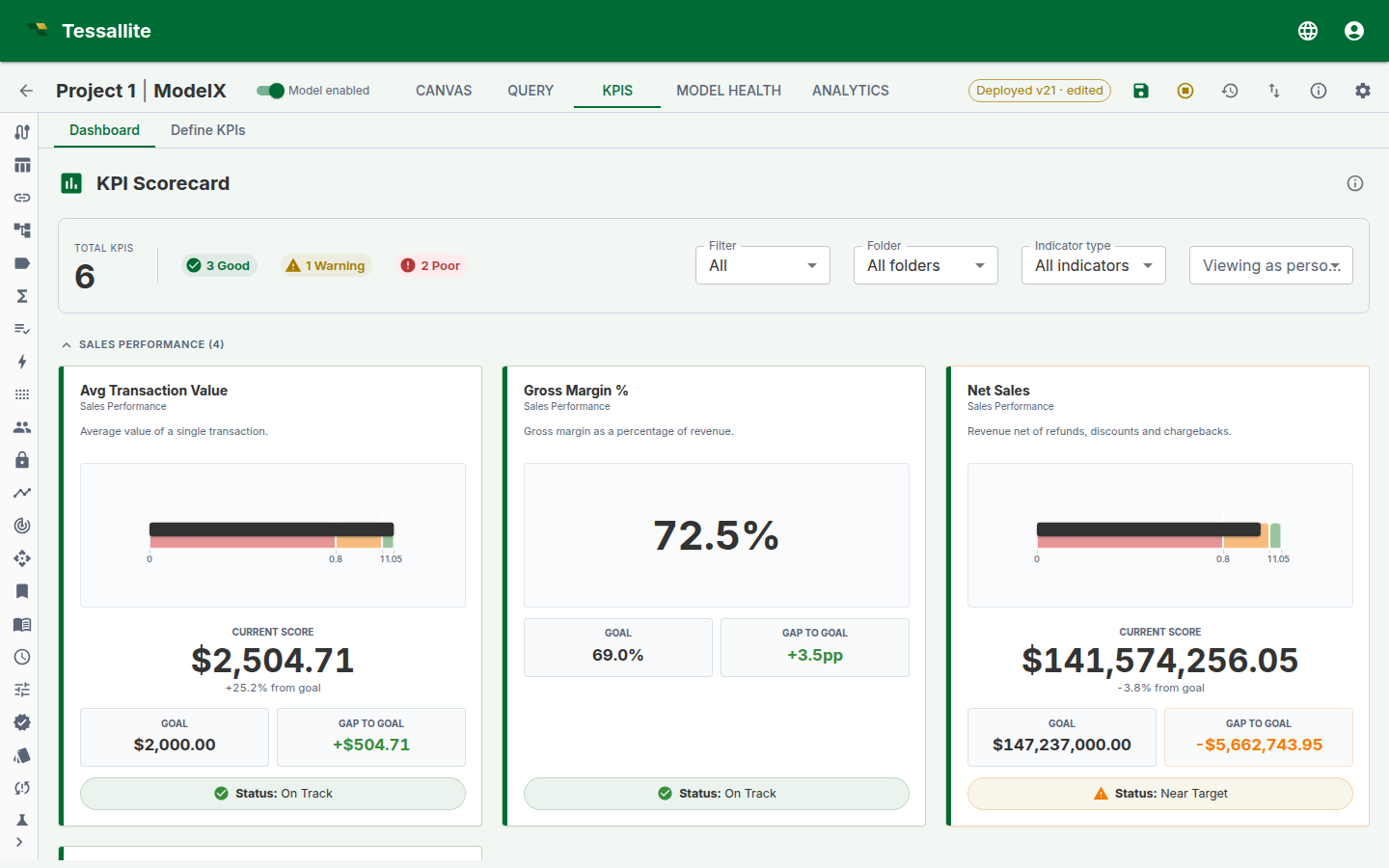
You can narrow the board several ways, and the filters combine:
- Certification — All, Certified only, or Deprecated.
- Display folder — show one folder, or all folders.
- Indicator type — show only Leading, only Lagging, or Unclassified KPIs. (Leading indicators predict where a number is heading; lagging ones report where it has already been.)
- Viewing as persona — preview the board exactly as a chosen persona would see it. KPIs that reference a measure outside that persona's scope drop out of view, so you can confirm what each audience is allowed to see before you publish. Choose "Default (no persona)" to see everything you are allowed to see.
- Click a KPI card to open it in the wizard.
The gauge always agrees with itself. On a card with a gauge, the needle, the coloured band it sits in, and the status badge (the RAG light) always tell the same story — the platform plots all three from one position the server worked out, so the needle can never land in a green band while the badge shows red. This holds even for "lower is better" KPIs and for percentile or z-score thresholds, where the good and bad ends are reversed.
Snapshot scheduling
In Step 4 of the wizard (only for non-draft KPIs):
- Under Historical snapshots, select a capture frequency (hourly, daily, weekly, monthly, quarterly, or none).
- Set the retention (how many snapshots to keep, 7 to 365).
- The system stores the cron schedule internally. You never need to write cron expressions.
Snapshots are captured by the scheduler service and stored in the kpi_snapshots table.
Tips and best practices
Formula selection
- Start with the simplest formula type that answers your question. “Single measure” covers most KPIs. Only reach for ratio, composite, or compare-periods when you genuinely need two values combined.
- If you need percentage change over time, use the time calculation (Percentage change or YoY growth %) rather than building a ratio between current and prior period measures. The time calculation handles the time-shifting automatically.
- For rate-based KPIs (conversion rate, defect rate), decide whether the source data already stores a rate (then use single measure with average aggregation) or whether you need to divide two counts (then use ratio).
Time windows and time calculations
- Always set a time window unless you genuinely want an all-time cumulative.
- For rolling comparisons, make the time window wider than the comparison offset. A YoY growth KPI needs at least 13 months of data in the window.
- “Last complete month” is almost always safer than “Last month” for reporting. It avoids partial-period distortion.
- Moving averages require N+1 periods of history. A 3-month moving average with “Last 3 months” as the window only has data for 3 periods — the first period’s average will be based on just 1 value. Use “Last 12 months” to give the average enough runway.
Filters, named lists, and parameters
- Use
safe_div()in the advanced editor for all division to avoid divide-by-zero errors. - For KPIs shared across teams, prefer parameters over hard-coded filters. One KPI definition with a
$Regionparameter replaces five region-specific KPI clones. - Use named lists whenever you find yourself typing the same set of values into multiple KPIs. The named list becomes the single source of truth.
- “Top N” named lists are ideal for concentration analysis. Combine “in Top 10” and “not in Top 10” filters on separate KPIs to see head vs tail behaviour.
- Combine multiple filters with care. Filters use AND logic: “Country = Germany AND Segment = Enterprise” means the KPI only includes German enterprise customers. If you accidentally over-filter, the KPI may return null (no matching data).
Performance and evaluation
- Use the Preview button frequently while building. It catches configuration errors early.
- Click Show SQL after preview to verify the generated query makes sense.
- For composite KPIs, create child KPIs first, then create the parent with
kpi("Child1") * literal(0.5) + kpi("Child2") * literal(0.5)in the advanced editor. - If a preview returns null, check: (1) does the time window cover dates that actually have data? (2) do the filter values exist in the data? (3) is the measure populated for the filtered slice?
Governance
- Certify KPIs once they are validated and approved for organisational use.
- Use display folders to group related KPIs (e.g. “Finance / Revenue”, “Ops / Delivery”).
- Add descriptions explaining the business meaning, not the technical formula. “Percentage of orders delivered within 5 business days” is better than “SLA compliance where days_to_deliver <= 5”.
Related
- KPIs (concept) — full conceptual reference including expression language, scorecard, alerts, and agent integration.
- Define Measures — create the measures that KPIs reference.
- Named Lists — reusable dimension member selections.
- Impact Analysis — check where KPIs are used downstream.